Thursday, December 9, 2010

Final Reflective Essay - Cookbook

I think the best way for me to gauge what I’ve learned is to go back and look at the scratch projects I created in the first lab of the term. I had never used Photoshop, I really had no idea what I was doing and yet, I was quite proud of those little projects. They were the foundation on which all of my following projects would build on. Fill in color, rotate shape, erase; that was about the extent of my knowledge.

Layers brought in a whole new style of working. There is so much freedom in layers, whereas before every mark was so permanent unless you wanted to press undo a hundred times and then lose the rest of your work. Messing around with the free transform tool, opacity, curves, hue, and saturation all expanded my knowledge and increased my skills as a Photoshop artist. These all came together when I was working on my book, enabling me to create something beautiful. And like those first scratch projects which I felt proud of for my level of Photoshop competence, I also feel proud of this book I’ve created through my gained experience and new found competence.

When I finished my first dummy I knew it wasn’t what I had envisioned but I assumed it was just the lack of pictures that made it seem so dry. The next day in class, Professor Arellano said something that made me realize what the problem was. He said that this wasn’t a report; it was our very own book. It shouldn’t have “the title”, and “the text”, and “the picture” and you’re done. It was a design project and I needed a better design. I trashed my old book design and started afresh; same concept; new look.

I made my book square to start, it seemed like the thing to do, and then made every page have common theme with basically the same layout. This helped but there was still something that made it feel rather dull. I figured it out after about 2 hours of trying to find a more lively color to make it come alive. It didn’t need a new color, it needed the same color stretched out from dark to light. For this I used the gradient tool and I used it a lot! Once I got that, the whole book fell into place.

These recipes are mainly my roommate’s recipes (the man on the right on the cover) and once we complete all seven days and take our own photographs of the food (all of the photos were taken from Google Images and are cited in the bibliography) we hope to be published and sell. Until then I think we will continue to make delicious meals and perhaps distribute the cookbooks as Zines in Ashland and Portland.


By Sam Hoiland


Friday, December 3, 2010

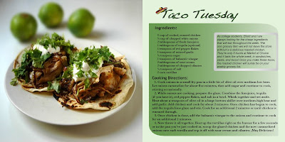
Cookbook (Final)


Weeday Cookbook
Designed by Sam Hoiland

Thursday, November 18, 2010

Sunday, November 7, 2010

Cubeecraft Project: Revisited

Furrilla³

Book Project: Proposal

For this project I will be making a cookbook using InDesign with both text and photographs of the finished dish. I’m attempting to make Seven dishes, one for everyday of the week. Each title will be something like “Monday Mash”, or “Stir Friday”.

The idea is to make a cookbook for college students who are on a budget, but also want a healthy, hardy, meal at least once a day. All the dishes will be dinner dishes and they’ll be in this format. Each of the seven dishes will have two pages in which there will be a photograph on one side and the ingredients and recipe on the other. The recipe will be set up thus.

There will be The Basic, which is essentially the one grain or base (rice, pasta, quinoa, tortilla, etc…), the protein (beans, meat, fish, egg, etc…) and the veggie (raw, steamed, sautéed, salad, etc…) and the basic seasoning (salt, pepper, ketchup, BBQ, etc…).

The next will be the add-on category or the If you have it…, which will add variety by listing a multitude a delicious vegetables, seasoning, and meat rubs, that go well with the dish.

And the final category will be the Grand Cuisine, which is fully loaded with everything from suggestions on presentation, to drinks of choice and mouth watering appetizers, not to mention some kitchen secrets that will surely make that girl you’re trying to impress jump right into your open arms as soon as she tries the first bight… Or something along those lines.

I’m still working on the title and I haven’t made up any of the full recipe sheets but I have a good idea of all the dishes I’d like to have on there. My first hurtle will be getting a good enough camera for the pictures of the dishes and then also convincing my roommate to let me take over the kitchen for a few weeks. It’s something I’ve been wanting to do for a while now and I think this is the perfect opportunity to try it out.

Poster Project #2

Red Lettering
[The Club]

Monday, November 1, 2010

Poster Project Reflective Essay

I wanted the “Poetry Slam” to be at the top of the visual hierarchy. I knew that that needed to be seen first so people would read on. I also didn’t want there to be too much going on, simple and clear always works for getting a message out. You see so many posters on campus that are just spattered with unnecessary designs, lines and shapes that distract from the selling point. I kept it clean and dirty, made it look fun but I had the professional organization to it as well. It naturally tells the eyes where to go. First at the “Poetry Slam” and then at the “Sou’s First” or maybe “[club]” and then down to the two figures with the information between them.

I was looking for a long time on the internet for a graffiti font but I had no luck so I decided to make my own. It shows the rap/hip-hop influence in slam poetry today but it’s not too much to the point where it might feel threatening to the reader.

I wanted excite poets around campus. For them to know that there is finally a club where they can be who they are and speak their words without judgment. I also wanted to excite the people on campus who didn’t know they were poet’s and maybe it just entices them to come to the meeting place because the sign roused their curiosity. I think I succeeded because I’ll get excited when I see it up around campus. I know I made it but if I hadn’t I think I would still be stoked to think that there were other poets like me who just want to express their lyrics with some like-minded people.

Poster Project


Poetry Slam [club]

Monday, October 25, 2010

Reflective Essay - Portraits and Letters

In a technical sense I would have to say that I learned the most while doing the portraits. With my self portrait, it took so long to get the lighting just right in my very dark apartment. And only after shooting about 50 shots was I able to get a clear reflection of myself TV. When I photographed my friend Jake (the climber), my flash completely blew out his hand so there was nothing but a white blob that needed to be completely reconstructed. I found the hardest thing about working on a photograph is that there are always continuous tones and any paint you put on the canvas is obviously not part of the original. This made it very hard therefore to reconstruct his hand without it looking like I had copied and pasted an image of Bart Simpson’s hand clutching the rock.

The ‘other’ photo I shot was a set-up. I told her about the project and that I’d love it if I could take her photo as my stranger pic. I’m not sure if she really got what I was talking about but she let me take the photo none-the-less. The first thing I did was crop it so that it wasn’t a full body shot. She told me that I needed to crop it so it didn’t show her belly. She hadn’t been expecting me to take the full shot and she said she would have sucked in had she known. It had been raining when I took the photo but her personality in the shot come across as very warm so I raised the color temperature up a bit.

My favorite letter-form was the Orange “J”. The pipe jumped out at me on my way to the rock gym to photograph my friend and since I had my camera with me I took a quick shot. It’s funny that those unexpected photos that have no planning or thought put into them, sometimes make you favorite shot of all. Once I got it into Photoshop I realized that it wasn’t obvious enough as a letter so I isolated it with the lasso tool and then inversed the selection and made everything else black and white. This along with some experimentation with contrast made the photo to my liking and officially complete.

Letters in our Habitat

Cereal "G"


SOU Bush

Shrubber "E"

Furilla "A"

Orange "J"

Portrait of Other

A strange friend of a friendly stranger

Self Portrait


Bowman

Thursday, October 21, 2010

Monday, October 18, 2010

Hoiland's Letter Project - Reflective Essay

I didn’t have to search for too long on any of the projects. Most of the time I would briefly scroll through the type faces and after seeing one or two I would think – I can make that work. Once they were on the canvas I’d rasterize them and then experiment with size rotation and color until I came up with a semblance of an idea. One of the challenges I faced was the color difference between the lab computers and my home computer. When I was working with “An Even Forest” on the lab computers every color appeared bright and complimentary, but when I downloaded it at home it looked like a very dead forest in the middle of a snot colored desert. However, this could just be the difference between my objective eye and my eye as the immediate artist. I might have been so involved in the making of it that I forgot it was no longer beautiful.

I had a plan to choose every letter very carefully with significance in my life in some way but by the second piece I scratched that notion and just chose whatever letter looked cool on the keyboard. So I started with a single letter on the canvas and went from there.

I would have to go with “Davyd and the ‘Y ith”. When Professor Inada was talking about scale contrast in lecture on Monday this image popped into my head. I didn’t know at the time that our next project would be about letters, but image that came to me was a large dragon that knew it was the king of it’s world until it looked over and there was the head of an enormous dragon that barely fit in the frame. I still wanted to incorporate this in my piece somehow so I translated my idea to a piece using only the letter Y. I knew that I was finished when The ‘Y ith’ had her scales.

Letter Project #5


Slightly R tistic

Letter Project #4


An Even Forest

Letter Project #3


The Red Tessssssssssalation

Letter Project #2


Sssssseriously trippy

Letter Project #1

Davyd and the "Y ith"

Sunday, October 10, 2010

Hoiland's Toy Project - Reflective Essay

My Cubee began with the simple dilemma of not knowing which color to choose for the body. Once it became apparent I was incapable of making such a tedious decision I did the only rational thing and refused to decide at all by choosing tie-dye. The dreadlocks seemed only natural once the shirt was in place, and then the purple hemp pants after that was a no-brainer.

The color of the skin took me a while and so did making the dreadlocks, especially making them look somewhat layered and multi-dimensional. Skin is tricky. It can come out looking like an orange if you aren’t careful. I messed with the palette until I found the right hue to make a believable hippie tan and then lowered the saturation. That along with the lighter value made it look more like a humanoid and less like a newly painted wall with a mouth and eyes. Whilst making the dreadlocks I decided that the easiest way to show they weren’t goldilocks curls was to pull them up to the top of the head and then have a wrap of hemp yarn coming out as if the cubee had put up his dreads for the occasion.

I can imagine my cubee on the streets of cubeland standing on some street corner holding a pen and a clip board trying to get people to sign a petition to save the whales. I guess I’ve stereotyped him a bit. He could really be anyone who attends the Oregon Country Fair or someone who just digs the feel of hemp against their legs and a burst of color on their chest and who doesn’t mind the upkeep of a head full of dreads. So basically, any good Ashlander.

Friday, October 8, 2010

Toy Project

There's a hippie boxed up inside of me

Sunday, October 3, 2010

Hoiland's Reflective Essay

I have to attribute everything I knew when starting this project to my hours spent doodling on Windows Paint in grade school. That knowledge helped me quite a bit but there was definitely more to learn. Layers were unfamiliar territory and they turned out to be essential in all of my scratch works. In my 3rd project, the ‘forest’, every color of tree was on a different layer and I wouldn’t have been able to create it without the layer tool. The lasso tool and the rotate selection were also some fun gadgets to explore. Just sitting down and playing with Paintshop for a few hours increased my speed and skill as a graphic artist. There were times when a complicated series of actions led to a pleasing final result, but just as often I was surprised at how the simple tools could go a long way. There seems to be infinite possible results and a million techniques and directions to get there.

I never started with a plan… On all three I just randomly chose a color and tool and made a shape. A blue rotated rectangle for the ‘Hinge Hound’ that ended up being the jaw, a teal circle that started the ‘Cry Baby’s’ head, and a yellow triangle to begin my forest of color. After the head was made in ‘Cry Baby’ (at the time just a solitary teal circle on a blank canvas), I panted a black ellipse inside it, which informed me I was making a screaming person. After the teeth were put in it was clear that this was a large crying baby and the following arms, filthy shirt, and legs seemed obvious. The background was quite by accident; some color fading tool that if held in a certain way made black and white stripes.

I think my favorite image was scratch project #3: "Soon To Be Field" – Forest. I say WAS because I actually had about a half an hour of unsaved work that was lost from it and I had to send in an unfinished version. At the time when the software freaked out and I lost my work I had it to a where it was a lot more detailed with a more populated forest and a cut down tree lying by the stump.

Scratch Project 3


"Soon To Be Field" - Forest

By Sam Hoiland

Scratch Project 2


Cry Baby

By Sam Hoiland

Scratch Project 1


Hinge Hound

By Sam Hoiland